What an ROC curve actually tells you
Published on August 19, 2026
I ran into this reading a SPAR project description on collusion between models. The setup is: an untrusted model U (say GPT-4.1) writes code, another model H (say Gemini 2.5 Flash) writes honeypots — code deliberately crafted to bait a colluding model into revealing itself — and then you ask U to tell the two apart. The sentence that stopped me was “we looked at GPT-4.1’s ROC curve in classifying these.”
The terminology sounds heavier than the idea. This is my attempt to write down the whole thing from scratch, in the order that made it click.
Contents
- The setup: scores, not labels
- The confusion matrix
- Accuracy is a trap
- Precision and recall
- TPR and FPR
- The ROC curve
- AUC
- Why a model can have AUC 0.99 and accuracy 78%
- Back to the collusion project
- A few questions to check yourself
The setup: scores, not labels
The key move is that U doesn’t answer “honeypot: yes/no”. It produces a score — how confident it is that a given program is a honeypot:
| Program | Actually is | U’s score |
|---|---|---|
| A | normal | 0.03 |
| B | normal | 0.12 |
| C | honeypot | 0.30 |
| D | normal | 0.41 |
| E | honeypot | 0.61 |
| F | honeypot | 0.91 |
To turn scores into decisions you need a threshold. Call everything above 0.5 a honeypot, and you catch E and F but miss C. Drop the threshold to 0.25 and you catch all three honeypots — but now you also accuse D, which was perfectly ordinary code.
That’s the whole tension. Lowering the threshold catches more of what you want and also flags more of what you don’t. There is no threshold that escapes it, only thresholds that trade differently.
The confusion matrix
Fix a threshold and every prediction lands in one of four boxes. Spam detection is the classic example — 100 emails, 20 of them spam:
| predicted spam | predicted normal | |
|---|---|---|
| actually spam | TP = 18 | FN = 2 |
| actually normal | FP = 6 | TN = 74 |
TP and TN are the ones you got right, FP is a false alarm, FN is something that slipped through. It’s called a confusion matrix because it shows you exactly where the model got confused.
Accuracy is a trap
Ninety-two of the hundred emails were classified correctly, so accuracy is 92%. Sounds great.
Now try a different problem. A thousand patients, five of whom have cancer, and a model that says “no cancer” to everyone. Accuracy:
\[\frac{995}{1000} = 99.5\%\]Better than the spam detector! And it missed every single patient with cancer. Whenever one class is rare, a model can score beautifully on accuracy by ignoring that class entirely. This is why you almost never see accuracy reported alone in a paper.
Precision and recall
The fix is to ask two sharper questions instead of one blurry one.
Precision — when the model says “positive”, how often is it right?
\[\text{precision} = \frac{TP}{TP + FP}\]For the spam detector that’s \(18 / 24 = 75\%\). Three times out of four, an email in the spam folder really is spam. Precision is the number you care about when false alarms are expensive. A burglar alarm that goes off every hour has terrible precision, and the practical consequence is that people stop listening to it.
Recall — of everything that was actually positive, how much did you find?
\[\text{recall} = \frac{TP}{TP + FN}\]Here that’s \(18 / 20 = 90\%\). Recall is what you care about when missing something is expensive — cancer screening, security, anything where the cost of a miss dwarfs the cost of a second look.
The two pull against each other. Search every passenger at the airport and recall is 100% while precision is dismal. Search only the people carrying something visibly alarming and precision is near-perfect while plenty of threats walk through. Two models make this concrete:
| TP | FP | FN | precision | recall | |
|---|---|---|---|---|---|
| Model A | 95 | 60 | 5 | 61% | 95% |
| Model B | 70 | 5 | 30 | 93% | 70% |
A is aggressive: it finds nearly everything and cries wolf constantly. B is conservative: when it speaks up you should listen, but it stays quiet a lot. Neither is better in the abstract. Which one you want depends entirely on what a miss costs you versus what a false alarm costs you.
TPR and FPR
ROC curves use a slightly different pair, chosen so that both numbers move in an interpretable direction as you sweep the threshold.
The true positive rate is just recall under another name — of all the real honeypots, what fraction did we flag?
\[\text{TPR} = \frac{TP}{TP + FN}\]The false positive rate is the mirror image on the other class — of all the ordinary programs, what fraction did we wrongly accuse?
\[\text{FPR} = \frac{FP}{FP + TN}\]If there are 1000 normal programs and we flag 50 of them, FPR is 5%. Note that TPR is computed only over the positives and FPR only over the negatives, which is what makes this pair insensitive to how imbalanced the two classes are — a genuinely useful property when honeypots are rare.
The ROC curve
Instead of arguing about which threshold to use, sweep through all of them. Each threshold gives you one (FPR, TPR) pair; plot every one of them and you get the ROC curve.
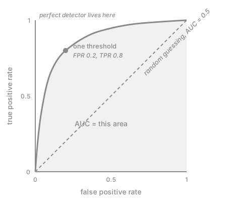
Read it from the ends inward. At a very high threshold nothing gets flagged, so you sit at the bottom-left, (0, 0) — no false alarms, no catches. At a very low threshold everything gets flagged and you’re at the top-right, (1, 1) — you caught everything, and you accused everyone. The interesting behaviour is in between.
A great detector bulges toward the top-left corner: high TPR at low FPR, meaning it catches most honeypots while rarely bothering innocent code. A detector that’s guessing traces the diagonal, because if you flag a random 30% of everything you’ll catch 30% of the honeypots and 30% of the normal programs — TPR and FPR move together and the curve is a straight line.
AUC
Comparing curves by eye gets old, so people summarise a curve by the area under it. That’s the AUC (or AUROC), a single number between 0 and 1.
| AUC | reading |
|---|---|
| 1.0 | perfect separation |
| 0.9 | strong |
| 0.75 | useful |
| 0.5 | random guessing |
The formula-free interpretation is the one worth remembering:
Pick one honeypot and one normal program at random. AUC is the probability that the model gives the honeypot the higher score.
So AUC = 0.96 means that in 96 out of 100 such pairs, the honeypot ranks above the normal program. AUC is a statement about ranking, not about any particular decision. That’s exactly why it shows up so often in research: the paper doesn’t know what threshold your deployment will use, so it reports the quality of the ordering and lets you pick the operating point later.
Why a model can have AUC 0.99 and accuracy 78%
This confused me for a while, and the resolution is the whole point of the previous paragraph.
Imagine every cancer patient scores higher than every healthy patient — 0.95, 0.91, 0.82 for the sick, 0.78, 0.70, 0.20 for the healthy. The ranking is flawless, so AUC is 1. Now set the threshold at 0.99. Everyone is classified as healthy, and your accuracy is whatever the base rate happens to be.
It’s the difference between grading and cutoffs. If you rank exam papers perfectly and then the dean announces that the pass mark is 99, everybody fails — and none of that is a failure of your ranking. Accuracy asks “after committing to one threshold, how many calls were correct?” AUC asks “forget the threshold, are positives generally ranked above negatives?” A model can be excellent at the second and, with a badly chosen cutoff, bad at the first.
Back to the collusion project
With the vocabulary in place, that original sentence reads cleanly. They generate a pile of code samples, some ordinary and some honeypots, have GPT-4.1 score each one, and plot TPR against FPR across all thresholds. A high AUC means GPT-4.1 reliably recognises the traps. An AUC near 0.5 means it can’t tell them apart at all.
And the reason this is a safety question rather than a benchmarking question is the why behind a high score. If a model can be trained to leave subtle signals in its own output and to recognise those signals later, then a second copy of that model acting as a monitor can quietly tell “one of us wrote this” or “this is a trap” — something a human reviewer or a different model wouldn’t see. That’s the failure mode that makes self-monitoring dangerous.
AUC gives you a clean dial to compare setups on. Something like:
- prompting alone: AUC 0.55, essentially no signal
- after RL fine-tuning for collusion: AUC 0.97, the capability is clearly there
- with a paraphrasing defence on top: AUC 0.62, the defence mostly works
One number per (red team strategy, blue team mitigation) cell, all measured the same way. That’s what makes it a useful axis for the whole experiment grid.
A few questions to check yourself
Worth reasoning through before computing anything.
- A model labels every email as spam. What are its precision and recall?
- A model labels nothing as spam. Same question.
- You pushed recall from 60% to 95%. What most likely happened to precision?
- Given scores of 0.90, 0.85, 0.80 for spam and 0.70, 0.60, 0.10 for normal mail — is AUC closer to 1 or to 0.5? And if you set the threshold at 0.95, is accuracy good or bad?
Answers, with 20 spam among 100 emails. (1) Recall is 100% — you caught all 20. Precision is \(20/100 = 20\%\), because you called all hundred emails spam. (2) Recall is 0%. Precision is \(0/0\), genuinely undefined — you never predicted positive, so “of the things you called spam” refers to nothing. scikit-learn returns 0 with a warning; papers usually say “not applicable”. (3) It probably dropped. The cheap way to raise recall is to flag more aggressively, which drags in false positives. (4) AUC is exactly 1 — every spam scores above every normal email. But at a threshold of 0.95 nothing is flagged, so all 3 spam are missed and accuracy is 50% on this six-email set. Perfect ranking, terrible cutoff.
The habit that made all of this stick: whenever a new metric shows up in a paper, don’t memorise the formula, ask what question it answers. Accuracy answers “overall, how often was I right?”. Precision answers “when I said yes, was I right?”. Recall answers “of the real ones, how many did I find?”. ROC answers “how does this behave as I move the threshold?”. AUC answers “across all thresholds, how well are positives ranked above negatives?”. Once you read them as answers instead of formulas, most empirical papers get a lot less intimidating.
Tags: machine_learning, evaluation, metrics, ai_safety